Portfolio
Anoba Studios
- Date: 2015
- Tools: UXPin, Adobe Illustrator
Anoba Studios is a multimedia production company based in NYC. The organization serves to facilitate the promotion of multiple entertainment media. Having various commercial elements, it is imperative that the digital experience be cohesive for consumers seeking any avenue of content.
The Objective
Anoba Studios wanted to build a website to showcase a new content catalogue for their upcoming collections, along with a storefront for customers and enthusiasts to purchase their merchandise.
The Process
Our designers decided to begin our research with persona drafting. The data sourced was compiled from interviews as well as market analysis. Below examples of our personas can be seen:
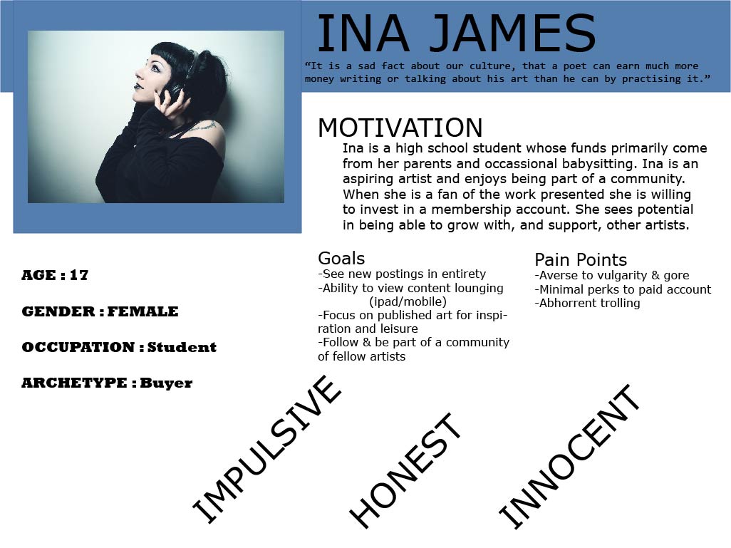
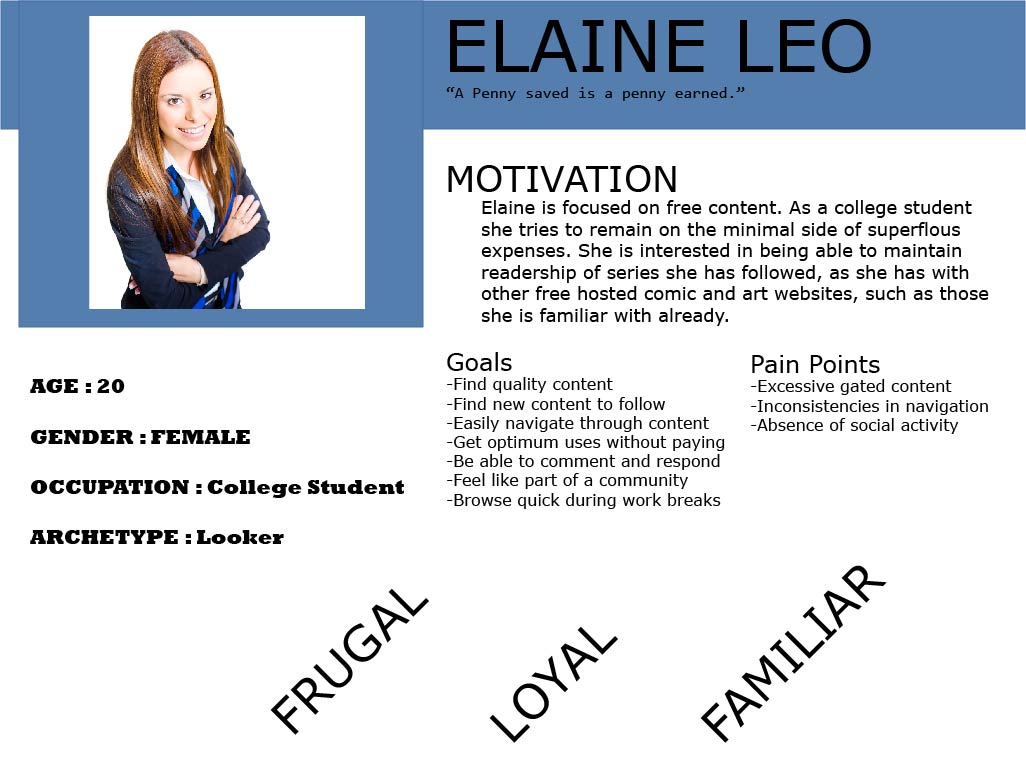
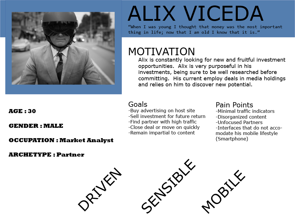
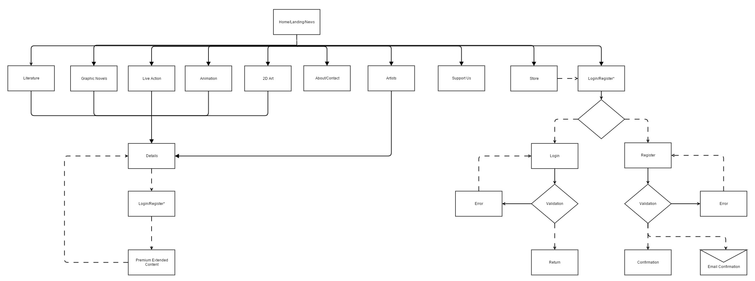
Iterations based on user profiling led us move through sitemapping of the product.
The Result
An interactive prototype was constructed in conclusion of research, applying familiar solutions for the product's varied userbase.
Aquaneers Inc.
- Date: 2016
- Tools: WordPress
Aquaneers Inc. is a fresh water solution where environmentality meets technological innovation. The company, which was founded out of New York University's Polytechnic School, seeks to provide revolutionary desalinization technology to a worldwide audience in need.

The Objective
Aquaneers already had a website, but the team needed branding and web design solutions. Their current page was dated and did not reflect their maturing brand. While it had an overload of detailed technical information it did not concisely convey the value of their research, or the urgency in the need for funders to back this burgeoning project. I had the pleasure of teaming up with Aquaneers Inc. to create a website where Aquaneers could tell their story, and easily provide all of the materials needed for funders to consider them for grant requests, most effectively.

Previous Aquaneers Website
The Process
From aesthetic to functionality this site needed to reflect the nature of the aquatics it represents. Visual responsiveness and ease of navigation were a top priority. I conducted interviews of Aquaneers members, as well as development, and clean energy professionals to determine the most immediate needs:
- An easily distributable one-pager highlighting the Aquaneers project and mission
- Notable updates on awards and technological development for continued funding consideration
- A simple explainer describing the process and emphasizing industry relevant keywords such as “hydrogen”, and “CO2 utilization”
I then took this insight paired with market research and competitor analysis to begin iterating mockups of what would provide the best impact for Aquaneers. After establishing the best performing version I took this project to development in WordPress.
The Result
We highlighted the key sections with brief and graphic explainers for how the technology operates. With a clear CTA calling for a 1 pager download external teams were easily able to digest, obtain, and disseminate this information to the rest of their teams for review. This design contributed $1 million in funding and grants received for the Aquaneers team to continue sustainable energy work.
Lauren Fiasconaro Photography
- Date: 2014
- Tools: HTML, CSS, JavaScript
Lauren Fiasconaro is a visual artist who specializes in photography. At the time of this project's creation she was a student and freelancing artist in need of a digital portfolio space.
The Objective
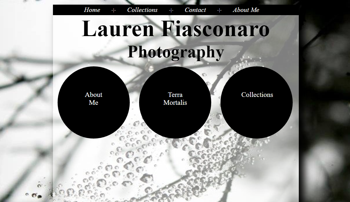
My team was tasked with creating a preliminary artist protfolio for Lauren Fiasconaro. It served to showcase her thesis as well as collective aesthetics. It was imperative that the range of work displayed here was clearly presented, and quickly digestable for browsers.
The Process
Breaking up galleries into teaser slideshows helped provide an overview of several sets of pieces at once. We maintained the familiarity of the automated presentation theme throughout the portfolio.


Usability testing was done with subjects unfamiliar with the mission or development of this project. Methodology was refined based on the recorded responses and results.
The Result
With this methodology of development and testing we were able to create a compelling experience which we could ensure users were able to appreciate total immersion they could comfortably navigate.
Project Pulso
- Date: 2020
- Tools: Chatbots, Wordpress, Facebook Messenger
Pulso is a non-profit multimedia and news organization, that shares history and culture stories by Latinos, for Latinos, dedicated to keeping the pulse on nuestra gente. Pulso builds deep digital relationships with a growing subscriber base of more than 2 million Latino people across the United States, and inspires the increase in political power of the projected 32 million Hispanic voters.

The Objective
Pulso’s primary product is a compelling News subscription that brings updates directly to the Hispanic community through their phones on Facebook messenger. While this service may see an influx of subscribers, retaining that engagement on the app and organizational website proves to be an ongoing challenge. The task at hand is to assess and adjust the platform so that it can be used to increase voting commitments, as well as scale monetizable subscribership.


The Process
I first assessed the qualitative and quantitative feedback we could record from users. I was able to compile written user responses from unsubscribe reasoning provided, survey answers, and miscellaneous submissions. I then used our analytics tools including Facebook Analytics, Google Analytics, and heroku tagged metrics to track data points throughout our user flows for dropoff, activity, and key conversion points such as donations and voting commitments.


Segments of users were tracked to determine how they converted on messaging
- 26% of users expressed there were too many messages.
- 82% of users did not finish our stories.
- Most users stopped interacting after 3 clicks of a story.
- Users are significantly more likely to convert when organically finishing a story, rather than being forced to a conversion prompt after stalling in the middle of a story.

I sketched variable chatflows we could present to users to better help them organically finish our broadcasting and continue to convert. In addition to this I designed a set of segmenting criteria to separate audiences based on their likelihood to convert compared to their volatility to unsubscribe based on data points including those aforementioned. These groups would be used to manage frequency of messaging and better influence targeting for scalable subscribership moving forward.
The Result
Adjusting the lengthiness of our messaging as well as segmentation criteria had drastically positive results, since organic completion meant that users could seamlessly transition from the content they were interested in receiving to then converting on voting commitments or monetary contributions on the website.
- Scale of subscribership increased 300%.
- 100,000 voting commitments converetd during the 2020 election.
- Established user pathways for improved conversion within the app and turned it into webpage landings for a cross revenue generating strategy.
Project Name
Lorem ipsum dolor sit amet consectetur.

Use this area to describe your project. Lorem ipsum dolor sit amet, consectetur adipisicing elit. Est blanditiis dolorem culpa incidunt minus dignissimos deserunt repellat aperiam quasi sunt officia expedita beatae cupiditate, maiores repudiandae, nostrum, reiciendis facere nemo!
- Date: January 2017
- Client: Southwest
- Category: Website Design
Project Name
Lorem ipsum dolor sit amet consectetur.

Use this area to describe your project. Lorem ipsum dolor sit amet, consectetur adipisicing elit. Est blanditiis dolorem culpa incidunt minus dignissimos deserunt repellat aperiam quasi sunt officia expedita beatae cupiditate, maiores repudiandae, nostrum, reiciendis facere nemo!
- Date: January 2017
- Client: Window
- Category: Photography
